


In a world where every second counts, mobile navigation menus are the unsung heroes of user experience. Imagine trying to find your favorite pizza place on a tiny screen while your stomach growls louder than a lion—frustrating, right? A well-designed mobile navigation menu can turn that chaos into a smooth ride, guiding users like a trusty GPS through the maze of options.
Overview of Mobile Navigation Menus
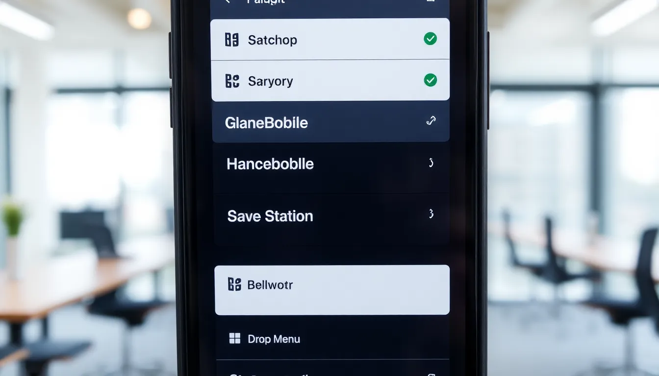
Mobile navigation menus provide essential functionality for users accessing websites or applications on smaller screens. Effective mobile navigation organizes content intuitively, ensuring seamless user interactions. For instance, a burger menu icon often houses navigation links in a compact form, maximizing available screen space.
These menus enable quick access to key sections, such as home, contact, services, and products. Users often engage with these menus more frequently compared to traditional desktop navigation, given the varying contexts of mobile usage. Understanding user behavior helps in designing menus that elevate the overall experience.
Responsive design principles inform the adaptability of mobile navigation. A well-executed navigation menu adjusts to different screen sizes, allowing for smooth transitions between devices. Icons along with text labels enhance clarity, reducing cognitive load.
Research indicates that users prefer touch-friendly elements within mobile menus. Larger buttons or sizable touch targets can significantly improve interactions, making it easier for users to navigate without frustration. Prioritizing essential links within the menu also prevents users from feeling overwhelmed.
Animations, when used judiciously, can enhance the navigation experience. Subtle transitions between menu states create a responsive feel. User feedback further emphasizes the importance of straightforward navigational structures, as complexity often leads to user disengagement.
Mobile navigation menus play a pivotal role in facilitating efficient user experiences on mobile devices. Designing them with a focus on accessibility, intuitiveness, and clarity ensures that users can find what they need swiftly and effortlessly.
Types of Mobile Navigation Menus
Mobile navigation menus come in various styles, making it essential to choose the right one for optimal user experience. Each type caters to different use cases and enhances accessibility.
Hamburger Menus
Hamburger menus feature a three-line icon representing the menu. This design minimizes screen space while keeping navigation options accessible. Users typically tap the icon to reveal the menu, which can include links to crucial sections like home, services, and contact. Research indicates that 50% of users prefer hamburger menus for their simplicity. Designers often use this type when the content volume is high, ensuring a clean layout without overwhelming the user.
Tab Bar Menus
Tab bar menus appear at the bottom of the screen, showcasing key navigational options in a fixed format. This design provides quick access to major sections, which helps retain user focus. Users interact with tabs intuitively, often tapping them to switch between categories like home, search, and profile. Data shows that tab bars improve user engagement by up to 40% compared to other menu types. This style suits applications where user interaction occurs frequently, promoting seamless navigation.
Dropdown Menus
Dropdown menus consist of a primary button that expands to reveal additional options. This design efficiently organizes content into categories while maintaining a compact appearance. Users can navigate extensive listings without clutter, frequently experiencing dropdowns in e-commerce settings for product selection. Effective dropdown implementation results in higher user satisfaction, as it simplifies the decision-making process. Research indicates that well-structured dropdowns can enhance user retention by providing a clear path to desired information.
Best Practices for Mobile Navigation Menus
Mobile navigation menus prioritize usability, ensuring effortless navigation for users. Effective design elements significantly enhance user interactions and overall satisfaction.
User Experience Considerations
User experience heavily relies on simplicity in navigation menus. Clear layout ensures users find essential sections quickly. Navigation should minimize scrolling and eliminate clutter. Large tap targets enhance touch interactions, leading to fewer mistakes. Consistent design across menus reinforces familiarity. Highlighting active sections aids users in tracking their location within the app or site. Test menu usability with real users to gather feedback and optimize designs. These refinements promote a smooth navigation flow, ultimately improving user engagement.
Accessibility Guidelines
Accessibility in mobile navigation menus requires thoughtful design choices. Use text labels that clearly describe sections, helping visually impaired users. High-contrast colors enhance visibility for users with low vision. Ensure all interactive elements are accessible through keyboard navigation. Screen reader compatibility allows users with disabilities to engage fully. ARIA (Accessible Rich Internet Applications) attributes should be implemented for better narration. Testing with accessibility tools ensures that menus function correctly for all users. Prioritizing these guidelines fosters an inclusive environment, improving overall user experience and satisfaction.
Tools and Technologies for Implementing Mobile Navigation Menus
Mobile navigation menus rely on various frameworks, libraries, and custom solutions. Each approach offers unique advantages tailored to specific needs.
Frameworks and Libraries
Frameworks and libraries streamline mobile navigation development. Popular options like Bootstrap, Foundation, and jQuery Mobile provide pre-built components and responsive designs. Developers appreciate Bootstrap’s grid system for creating flexible layouts and easy navigation. Foundation offers accessibility features, making it suitable for diverse user needs. jQuery Mobile simplifies touch interactions, catering to mobile users. These tools significantly reduce development time and improve efficiency by providing standardized solutions that adapt across devices.
Custom Solutions
Custom solutions offer unmatched flexibility in mobile navigation design. Developers often build tailored menus to align with branding and specific user requirements. This approach allows for unique layouts, animations, and interactions that enhance user experience. Some developers create navigation systems using HTML, CSS, and JavaScript, ensuring the menu reflects the application’s aesthetic. Custom solutions accommodate specific content organization, keeping essential links prioritized. Although more time-consuming, these menus can lead to higher engagement and satisfaction rates when executed effectively.
Conclusion
Mobile navigation menus are indispensable for ensuring a smooth and efficient user experience on smaller screens. Their design directly impacts how users interact with content and access key features. By prioritizing intuitive layouts and touch-friendly elements, developers can significantly enhance user satisfaction.
The choice of navigation style also plays a crucial role in engagement. Whether opting for hamburger menus, tab bars, or dropdowns, each serves a unique purpose that can cater to different user needs. Thoughtful design choices, accessibility considerations, and the right tools can elevate mobile navigation from a simple feature to a vital component of an effective mobile strategy. Embracing these principles will not only streamline navigation but also foster a more inclusive and enjoyable experience for all users.

