


The world of web design can feel like a chaotic game of Tetris, with elements jostling for space and alignment. Enter the CSS grid system, the superhero of layout management that swoops in to save the day. With its powerful yet straightforward approach, it transforms messy designs into seamless masterpieces.
Overview Of CSS Grid System
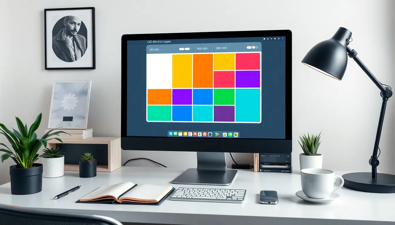
The CSS grid system is a powerful layout tool that streamlines the design process, facilitating organized, responsive web layouts. It simplifies the complexities of arranging elements on a webpage.
Definition And Importance
CSS grid defines a two-dimensional layout system that enables designers to create flexible grid structures. This system allows for precise control over positioning and sizing of elements within a defined grid. As a result, it increases the efficiency of web design by reducing conflicting layouts and adapting seamlessly across various screen sizes. Its importance lies in the ability to create responsive designs that maintain visual consistency across devices, ensuring an optimal user experience.
Key Features
Key features of the CSS grid include grid templates, grid lines, and area definitions. Grid templates enable designers to set fixed or flexible rows and columns, providing structure. Grid lines serve as the framework for placing elements accurately within the layout. Area definitions allow for the naming of specific sections in the grid, simplifying the placement and management of content. Additional features like auto-placement and responsive adjustments enhance usability, enabling quicker iterations in design workflows.
Getting Started With CSS Grid
CSS Grid allows developers to create complex web layouts with ease. Understanding its basic syntax and properties is essential for effective implementation.
Basic Syntax
CSS Grid utilizes a straightforward syntax that defines the structure of the layout. A grid container is established using display: grid;, setting the foundation for a grid system. Rows and columns can then be defined through properties like grid-template-rows and grid-template-columns. By specifying values, developers control the dimensions of each grid track. Grid items automatically align within the specified areas, creating a well-organized arrangement. It’s possible to implement fractional units (fr) for flexible sizing, making the layout adaptable to different screen sizes.
Common Properties
Various properties enhance the control developers have over grid layouts. grid-gap manages the space between rows and columns, ensuring a clear separation of grid items. The grid-area property allows for specific item placement within defined grid areas, enabling precise control of content positioning and overlap. Alignment properties like align-items and justify-items facilitate vertical and horizontal alignment, respectively. Auto-placement options, defined by grid-auto-flow, streamline the layout process, improving efficiency in organizing elements. These properties contribute to the modular and responsive features of the CSS grid, significantly improving design workflow.
Creating Layouts Using CSS Grid
Creating layouts with the CSS grid system enables developers to achieve structured and visually appealing designs. By defining a grid structure, users can efficiently manage the placement of elements.
Defining Rows And Columns
Developers specify the size and number of rows and columns using the grid-template-rows and grid-template-columns properties. Each property accepts various units like pixels, percentages, or fractional units (fr), allowing for flexible design. For instance, a grid setup that features three columns of equal width can be formulated with grid-template-columns: 1fr 1fr 1fr. This approach ensures proportional spacing on all device sizes. Additionally, specifying rows can occur similarly by leveraging grid-template-rows. Adjusting these settings supports responsive web designs and enhances the overall user experience.
Placing Grid Items
Placing items within a grid involves using the grid-area property for precise customization. Developers can assign specific grid areas using a defined naming scheme or by referring to grid lines. For example, combining grid-row-start and grid-column-start properties positions an item at the desired location. Utilizing the auto-placement feature simplifies this task, allowing items to fill available spaces automatically. Adjustments using properties like align-self and justify-self further refine item alignment within their designated grid areas. These capabilities streamline the development process while maintaining a consistent layout across various devices.
Advanced CSS Grid Techniques
Advanced techniques in the CSS grid system unlock greater design potential and flexibility. By mastering these methods, developers enhance responsiveness and adaptability in web layouts.
Responsive Design
Responsive design leverages CSS grid features to ensure layouts adjust seamlessly across various screen sizes. Using media queries alongside grid properties allows for specific adjustments based on device dimensions. Developers often implement different grid configurations for mobile, tablet, and desktop views, optimizing user experience. The minmax() function proves useful for setting minimum and maximum sizes, promoting fluid responsiveness. Additionally, grid templates can be altered according to breakpoints, assigning distinct columns or rows at different resolutions. This approach simplifies the transition between layouts, creating visually appealing designs that maintain functionality regardless of the viewing platform.
Nested Grids
Nested grids provide extra layers of organization within a primary grid layout. Developers can create child grids inside grid items, enhancing design complexity without sacrificing clarity. Specific classes or IDs identify nested grids, allowing for targeted styling. With properties like grid-template-areas, it becomes simpler to define areas within smaller grids. Placing multiple items inside these nested grids ensures an orderly arrangement, improving content management. Furthermore, using grid-auto-flow: dense can help optimize space within nested structures. Overall, nested grids offer powerful capabilities to create intricate designs while maintaining responsive behavior on various devices.
Best Practices For Using CSS Grid
Effective use of the CSS grid system enhances web design by ensuring optimal layouts and user experience. Following best practices leads to efficient designs that are both functional and visually appealing.
Optimization Tips
Utilize fractional units for responsive designs. Fractional units, or fr, allocate space proportionally within the grid container. Set explicit widths for rows and columns to maintain consistency across devices. Use grid-gap to create uniform spacing between elements, which improves clarity. Adjust grid-template-areas to define complex layouts easily and ensure visual organization. Employ minmax() for flexible sizing, allowing columns to adapt to both minimum and maximum widths, which enhances responsiveness. Avoid overcomplicating layouts; simplicity often leads to better user interactions and performance.
Accessibility Considerations
Ensure the grid layout doesn’t hinder usability for screen readers. Use semantic HTML, which provides better context for assistive technologies. Label grid areas with descriptive names that convey their purpose. Maintain a logical reading order by structuring elements in a way that follows visual layouts. Test designs across various devices to ensure all users enjoy a seamless experience. Provide clear focus indicators for interactive elements within the grid. This practice supports keyboard navigation, making the design more inclusive for users with different abilities. Prioritize clear contrast between text and background colors to enhance legibility for all users.
Conclusion
The CSS grid system stands out as an essential framework for modern web design. Its flexibility and precision empower developers to create visually appealing and responsive layouts with ease. By mastering its features like grid templates and auto-placement, designers can significantly enhance their workflow and achieve complex designs without sacrificing clarity.
Emphasizing best practices ensures that layouts remain user-friendly and accessible across devices. As web design continues to evolve, the CSS grid system will undoubtedly remain a vital tool for creating organized and engaging digital experiences. Adopting these techniques not only streamlines the design process but also elevates the overall quality of web projects.

